When RRG misleads: limits and false rotations
What you will learn
- Why the RRG only ever looks backwards
- What a false rotation is and why sideways markets produce them
- How the benchmark choice changes the whole map
- The honest short list of what RRG cannot tell you
Every tool in this classroom gets an honesty chapter, and the RRG has earned one. It is a lovely map, but a map of where the crowd has been, not where it is going. Treat it as more than that and it will cost you money one day.
Limit 1: it is a rear-view mirror
Everything on an RRG is computed from past prices. A dot in Leading means the stock beat the market over the measured past. It says nothing certain about next month. Trends often continue, which is why the tool works at all, but “often” is not “always”. A rotation can be one day away from reversing, and the chart will not warn you; it only knows yesterday.
Limit 2: false rotations in choppy markets
When the whole market moves sideways, up a little, down a little, with no real trend, RRG dots spin like compass needles near a magnet. A sector darts into Improving, you note a “rotation beginning”, and two weeks later it has slipped back into Lagging without ever touching Leading. This is called a false rotation or a whipsaw: a signal that reverses before it pays off.
Sideways markets produce these constantly. The weekly view filters out some noise, not all. Act on every Improving-to-Leading crossing in a flat market and you get churned to bits, buying excitement that evaporates within days. This is not a rare edge case; choppy, trendless stretches are a large part of market life.
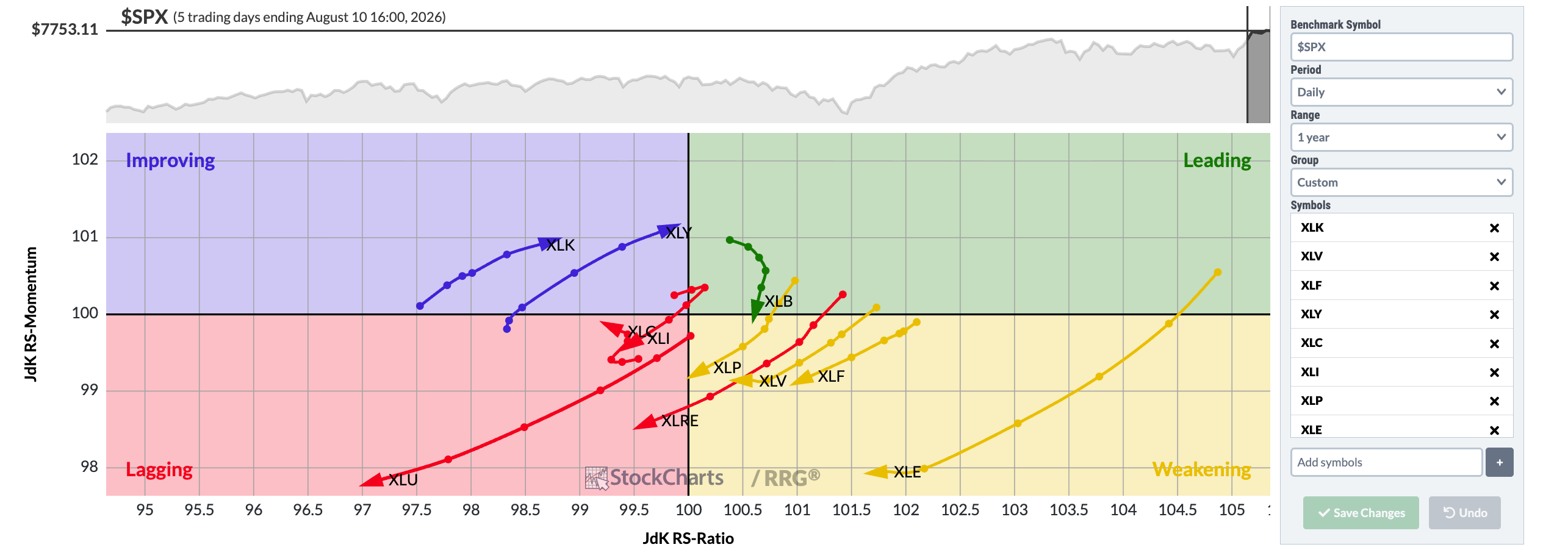
Chart courtesy of StockCharts.com
Here is the daily sector view: the S&P sector ETFs measured against the S&P 500 over one year. Watch for tails that double back; on a daily chart those reversals are constant, and each would be a false alarm if treated as a fresh trend.
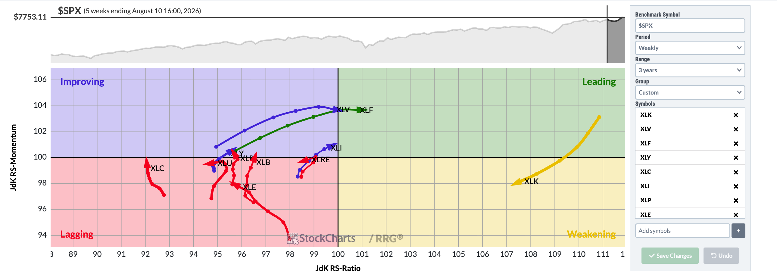
Chart courtesy of StockCharts.com
The weekly, three year view irons out much of that spinning, so the slower view deserves your first look, though even it cannot see the future.
Limit 3: the benchmark is a choice, and choices have consequences
Change the benchmark and the whole map rearranges. Apple measured against the S&P 500 might sit in Leading while, measured against a technology index, the same stock sits in Lagging, because its own sector outran it. Neither map is wrong; they answer different questions. Always ask: “strong relative to what?” A chart without that answer is decoration.
Limit 4: it ignores news, value, and business reality
The RRG does not know that Tesla just reported falling deliveries, or that a stock is wildly expensive, or that a company’s auditor resigned last night. A dot can glide serenely through Leading hours before a bad earnings report rewrites everything. Price tools are the last to know about fundamentals, which is why chapter 5’s routine exists.
The honest summary
Here is the fair verdict. The RRG is genuinely good at two things: showing the pecking order against a benchmark at a glance, and showing which way the crowd’s preference is drifting. It is genuinely bad at predicting turning points, telling real rotations from noise in flat markets, and knowing anything about business quality. Use it as a first filter and conversation starter, then do the filing work. Anyone who sells you a chart tool as a complete decision machine is selling a rear-view mirror as a crystal ball.
Try it yourself
Find a flat stretch on a long S&P 500 chart, months when the market went sideways. Then look at today’s daily sector RRG and imagine reading it during that stretch. Write down two crossings that look meaningful now, and check in three weeks whether either became a real Leading trend or fizzled into a false rotation.
Key takeaways
- The RRG is built entirely from past prices; it describes, it does not predict.
- Sideways markets generate false rotations; daily charts generate the most.
- The benchmark defines the map, so always ask “strong relative to what?”
- The chart cannot see news, valuation, or business quality; filings can.
- Used as a first filter and research prompt, the RRG earns its place; used as a decision machine, it misleads.
Read one real thing
Pull up the live weekly sector RRG on StockCharts.com one last time and find a tail that recently reversed direction. That reversal is this chapter in one squiggle: the map reporting that the crowd changed its mind after the fact.
Listen to this chapter
Read by Ritu, a synthetic voice from Sarvam AI