What an RRG is: the four quadrants in plain words
What you will learn
- What an RRG chart is and who made it
- What the two axes measure
- The four quadrants and what each says
- Why the centre is the benchmark itself
In the last chapter you learned that relative strength is the gap between a stock and the market. Now imagine plotting that gap for many stocks and sectors on one map, so you can see the whole race at a glance. That map exists: the Relative Rotation Graph, or RRG, free to view on StockCharts.com.
The man behind the map
The RRG was invented by a Dutch analyst, Julius de Kempenaer, in Amsterdam. He built it at the merchant bank Kempen & Co, answering a question clients kept asking: which five sectors do you like best? First came the JdK RS-Ratio, tracking the trend of relative strength; after the dot-com crash he added RS-Momentum, tracking whether that trend is speeding up or fading. Bloomberg put it on its terminals in January 2011 and StockCharts followed in July 2014, where Julius is a senior analyst today; it also runs on Optuma and LSEG terminals. He founded RRG Research, which owns the trademark, and wrote the chapter “Everything Is Relative - Strength Is Everything” in the 2011 Bloomberg Press book New Frontiers in Technical Analysis.
Most analysts never invent one tool the whole industry adopts; Julius did, out of a single client question. We write about RRG with Julius’s and StockCharts’ kind permission, and we are grateful for it; they have not reviewed or endorsed this course.
The two axes: level and speed
Think of a batsman’s form in cricket. Two questions matter. Is he scoring more than the team average this season? That is his level. Is he getting better or worse lately? That is his direction.
An RRG plots every stock or sector using those two questions:
- Horizontal axis (left to right): RS-Ratio. The level of relative strength. Right of centre means beating the benchmark; left of centre means losing to it.
- Vertical axis (up and down): RS-Momentum. Whether that strength is speeding up or fading. Above centre, momentum is improving; below centre, it is fading.
Both numbers come from the relative strength idea of chapter 1, smoothed so everything sits on one scale. Around 100 is the centre: the benchmark itself, the average runner defining the middle of the race.
The four quadrants
The two axes cut the map into four quadrants (a quadrant is one of four parts), each with a name and a colour on StockCharts:
- Leading (top right): beating the benchmark, and the lead is growing. The star batsman in form.
- Weakening (bottom right): still beating the benchmark, but the lead is shrinking. The star is tiring.
- Lagging (bottom left): losing to the benchmark, and getting worse. Out of form and out of luck.
- Improving (top left): still losing to the benchmark, but catching up. The underdog finding form.
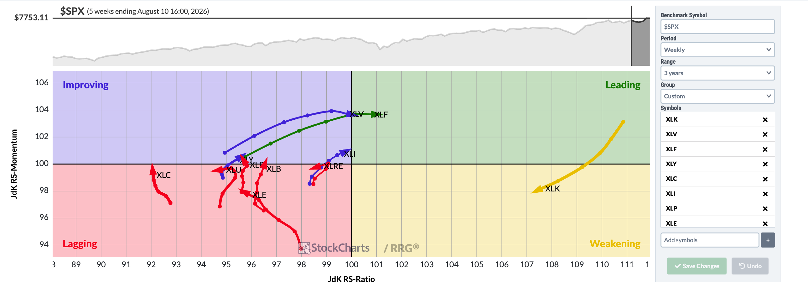
Chart courtesy of StockCharts.com
Notice how the S&P sector ETFs, the funds tracking sectors like technology, financials and healthcare, each sit in a coloured quadrant around the centre: the S&P 500 itself. In this capture the financials and healthcare funds sit in Leading, technology has cooled into Weakening with a long tail behind it, and energy sits in Lagging. The settings panel on the right shows the recipe: benchmark $SPX, weekly period, three year range.
Why “rotation”?
Watch the map over a few weeks and something lovely appears: stocks and sectors tend to travel clockwise. Improving turns into Leading, Leading cools into Weakening, Weakening sinks into Lagging, Lagging recovers into Improving. That circular journey gives the graph its name; chapter 3 reads those journeys in detail.
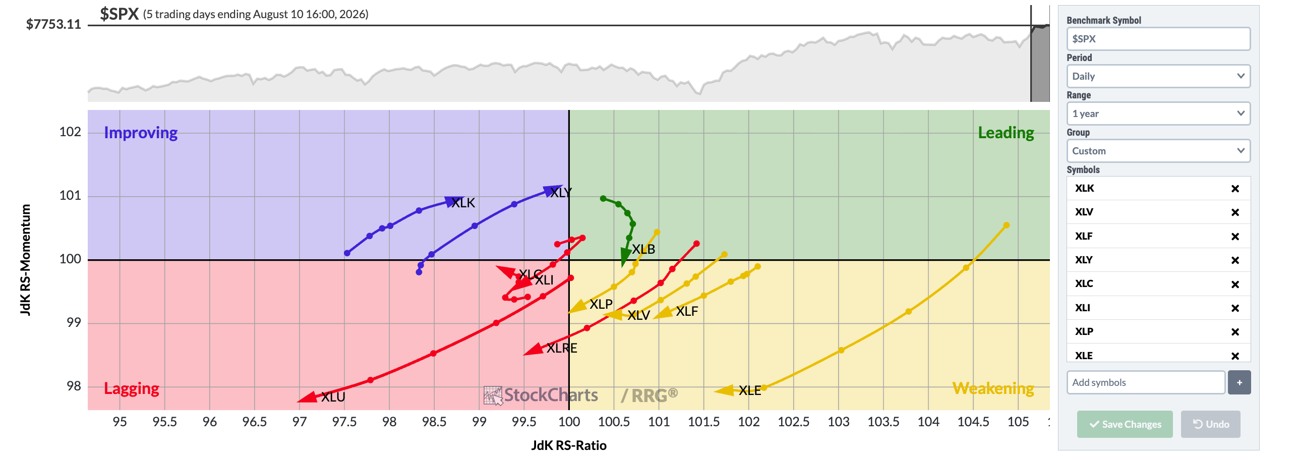
Chart courtesy of StockCharts.com
This second view keeps the same S&P sector ETFs but swaps the timeframe: the faster daily setting over a one year range, still measured against the S&P 500; the panel shows the recipe: benchmark $SPX, daily period. The window changes where each name sits: the timeframe is part of the message.
Try it yourself
Open the free RRG page on StockCharts.com and set it to the S&P sector view. Write down which sectors sit in Leading and which sit in Lagging. Do not judge good or bad yet; just practise naming quadrants.
Key takeaways
- RRG plots relative strength level (RS-Ratio, sideways) against its momentum (RS-Momentum, up and down).
- The centre of the chart is the benchmark; everything else is measured against it.
- Leading does not mean “buy” and Lagging does not mean “sell”; they describe race position, nothing more.
Read one real thing
Look again at the weekly screenshot above, then open the live version on StockCharts.com. Notice the short trails behind the live dots; they are the next chapter’s story.
Listen to this chapter
Read by Ritu, a synthetic voice from Sarvam AI