Reading rotations: leading, weakening, lagging, improving
What you will learn
- How to read the trail behind each dot on an RRG
- The clockwise rotation pattern and why it happens
- The difference between daily and weekly views
- How to describe a rotation in one plain sentence
Think of how seasons rotate. Summer leads into monsoon, monsoon into autumn, autumn into winter, winter back into summer. No season lasts forever, and they come in a familiar order. Money behaves a bit like that. The crowd gets excited about one part of the market, pours money in, gets bored or nervous, and moves to the next. This is called sector rotation: money rotating between sectors like technology, energy, healthcare, and banks. A sector is simply a group of similar companies.
The RRG makes this invisible migration visible.
The trail is the story
Each dot on an RRG has a short line behind it, called a tail. The tail shows where the dot was over recent periods: the dot is today, the tail is the past. When you read an RRG, you mostly read tails, because the direction of travel matters more than the current address.
The classic pattern, and it really is common, is clockwise:
- Improving (top left): still weaker than the market, but the tail points up and right. Gathering strength.
- Leading (top right): beating the market, and the lead grows. A trend is healthiest here.
- Weakening (bottom right): still ahead of the market, but the tail bends down. Momentum is leaking out.
- Lagging (bottom left): behind the market. Eventually the tail curves up toward Improving, and the wheel turns.
Serious readers work out a dot’s heading: the direction it travels, computed from the change in momentum versus the change in ratio. Position is the address; heading is the arrow. Our house rule: a name in Leading heading south, down toward Weakening, is excluded, not shortlisted. Trajectory matters more than position.
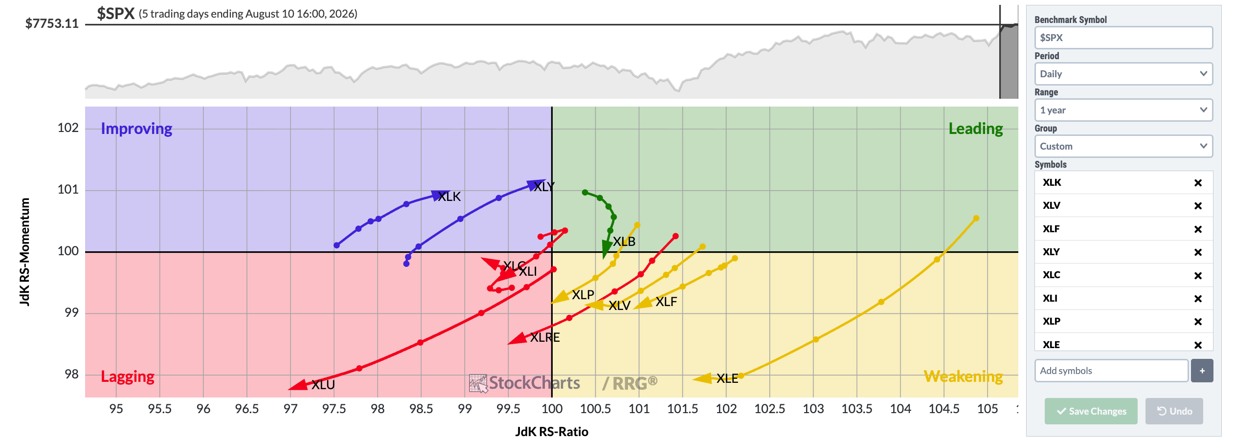
Chart courtesy of StockCharts.com
Here are the S&P sector ETFs on the daily RRG, one year of tails measured against the S&P 500. The skill: find tails curling clockwise, Improving up toward Leading or Leading down toward Weakening. Those curls are rotations in progress.
A worked example, in words
Imagine the weekly sector RRG shows the technology fund in Leading, but its tail has bent down for three weeks toward the Weakening border. Meanwhile the energy fund sits in Improving, tail pointing up and right, close to crossing into Leading.
Your notebook sentence: “Technology is still ahead of the market but losing steam; energy is behind the market but gaining fast.” That is a complete RRG reading. Notice what it does not say: not buy energy, not sell technology. It describes a rotation, the way a weather report describes wind. What you do with it needs more evidence, and that is chapter 5’s job.
Daily versus weekly: two speeds of the same movie
StockCharts lets you view RRGs on a daily timeframe (each step of the tail is one day) or a weekly one (each step is one week). The difference matters:
- Daily: fast and twitchy. Dots dart between quadrants on ordinary noise; dangerous if you treat every wiggle as a trend.
- Weekly: slow and calm. A rotation that survives here is more likely a real season change, not a cloudy afternoon.
Read the weekly first for the big picture, then the daily for detail. If they disagree, trust the slower one while you are learning.
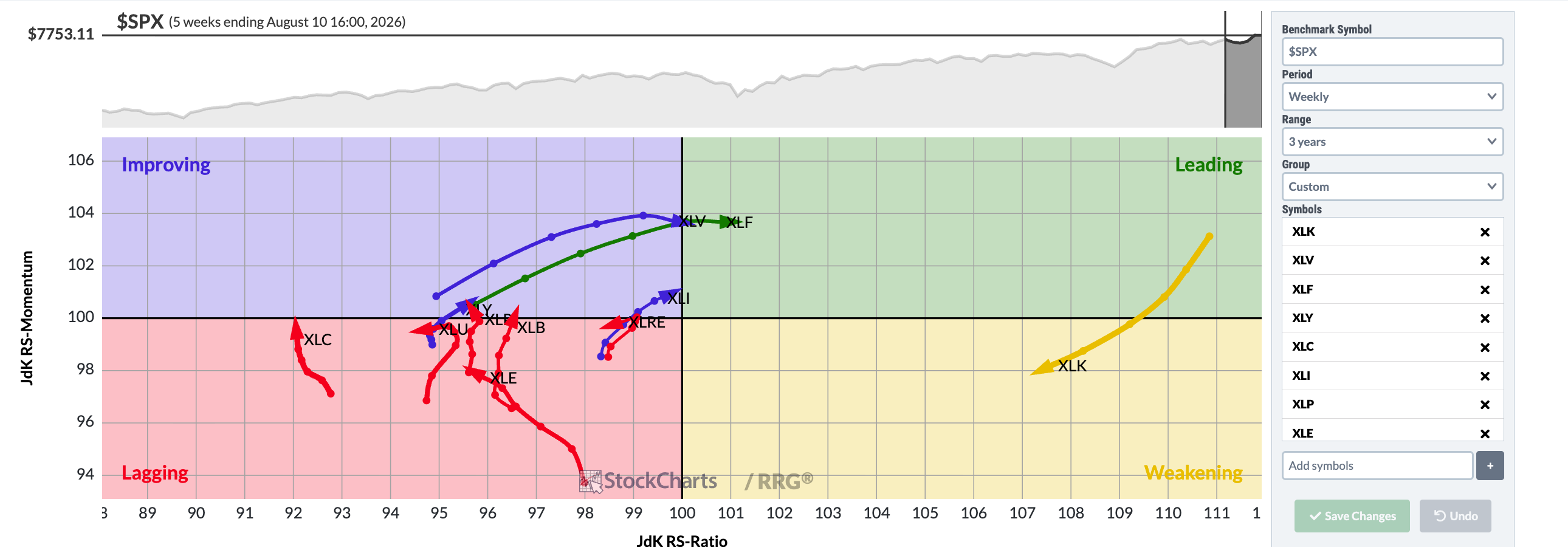
Chart courtesy of StockCharts.com
Same sectors, two timeframes: compare this weekly, three year view with the twitchier daily view above. The longer window smooths the tails, and a sector’s quadrant can differ between timeframes, so do not be surprised if a name leads here and dithers there. Three years of tails show where each sector has travelled from, not just where it sits.
Try it yourself
On the StockCharts RRG tool, open the S&P sectors on the weekly setting. Pick one sector in Leading and one in Improving. For each, write one sentence: where it is, which way its tail points, what that means in plain words. Repeat in a week and check whether the tails moved as you read them.
Key takeaways
- The dot shows today; the tail shows the journey. Trajectory beats position: a Leading dot heading south is excluded.
- Rotations usually run clockwise: Improving, Leading, Weakening, Lagging, and back around.
- Weekly views show truer trends; daily views show more noise.
- A rotation reading is a description, never an instruction.
Read one real thing
Open the live sector RRG on StockCharts.com and hover over any tail to see its past weekly positions. Notice how rarely a tail moves in a straight line.
Listen to this chapter
Read by Ritu, a synthetic voice from Sarvam AI